J'aime cet articleBlunt : une collection de classes CSS pour créer un layout responsive rapidement#CSS#Frameworks#Layout#ResponsiveDJo02 juin 2020 à 08h408440
J'aime cet articleSnowpack : un environnement de développement front moderne et rapide#Environnement#esmimport#frontDJo02 juin 2020 à 08h308290
J'aime cet articleHTMX : vos appels Ajax et Websockets directement dans vos balises HTML#Ajax#htmx#Javascript#WebsocketsDJo02 juin 2020 à 08h208570
J'aime cet articleCorona Warn App : l'app de suivi du COVID-19 allemande open source#corona#covid#Mobile#Open sourceDJo02 juin 2020 à 08h103180
J'aime cet articleGestion d'erreur et reporting d'erreur dans React avec Sentry#Erreurs#React.js#reporting#sentryDJo02 juin 2020 à 08h002310
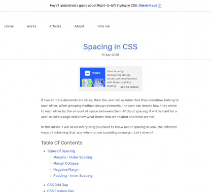
J'aime cet articleUn guide avec plein d'astuces et techniques sur les images en web#Astuces#Guide#images#TechniquesDJo29 avril 2020 à 08h505115
J'aime cet articleCe que j'aurais aimé savoir sur React.js quand j'ai développé ma première app#React.js#Retour d'expérienceDJo29 avril 2020 à 08h407403
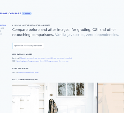
J'aime cet articleUn script JS moderne pour mettre en place un comparatif d'images sous forme de slider#comparatif#images#sliderDJo29 avril 2020 à 08h303975
J'aime cet articleUn guide pour bien démarrer avec Nuxt.js et le server-rendering de SPA#nuxtjs#Server rendering#Single Page AppDJo29 avril 2020 à 08h201335
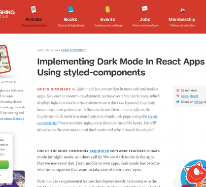
J'aime cet articleMettre en place des composants React en Dark mode#Composants#darkmode#React.jsDJo29 avril 2020 à 08h10775
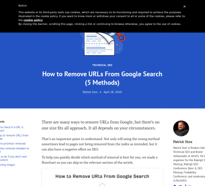
J'aime cet article5 méthodes pour désindexer / supprimer une URL de Google#desindexer#Google#lien#SEODJo29 avril 2020 à 08h001455
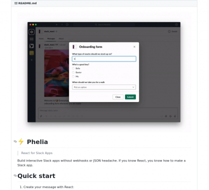
J'aime cet articlePhelia : un framework pour créer des applications Slack facilement en React#applications#Framework#React.js#slackDJo27 avril 2020 à 08h504733
J'aime cet article40 templates HTML de landing page gratuits#freebies#HTML#Landing#Layout#TemplatesDJo27 avril 2020 à 08h407823
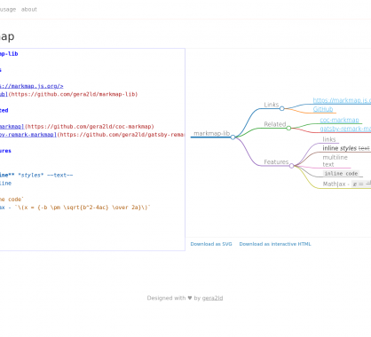
J'aime cet articleMarkmap : créez des graphes mindmap avec du Markdown#Graphes#Markdown#mindmapDJo27 avril 2020 à 08h305093
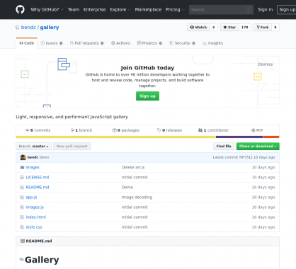
J'aime cet articleUne galerie d'images responsive et moderne très minimaliste#galerie#images#Responsive#zoomDJo27 avril 2020 à 08h205280
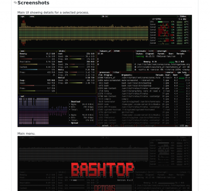
J'aime cet articleBashtop : un outil de monitoring de vos processus et ressources linux#Bash#Monitoring#topDJo27 avril 2020 à 08h004358
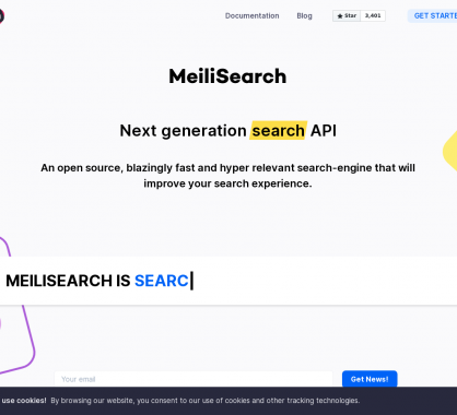
J'aime cet articleMeilisearch : un moteur de recherche open source rapide avec des fonctions intéressantes#Moteur#Open source#rechercheDJo31 mars 2020 à 08h306413
J'aime cet articleRaylib : une lib en C facile à prendre en main pour développer vos jeux vidéos#Développement#jeuxvideoDJo31 mars 2020 à 08h206900
J'aime cet article4 propriétés CSS Grid et une valeur qui devraient suffire pour tous vos layouts#CSS#Grid#LayoutDJo31 mars 2020 à 08h109450